
Identifying new shop implantation thanks to geo-data analysis
In this blog, we will see how we can perform geospatial data analysis in order to identify new business opportunities. For this showcase, we will focus on the retail sector and more precisely on the supermarket leading brands in Belgium: Colruyt, Delhaize, Carrefour, and Lidl. We analyzed the location of supermarkets in Brussels, computed the average time travel to the closest supermarket for Brussels neighborhood and see how these four major brands are sharing their market zone among Brussels neighborhood accordingly. We are reusing the techniques detailed in the Dynamic Web scrapping blog post. The techniques described in this post can be useful for all sorts of B2C companies involved in the retail sector, where competition is generally strong and shop implantation matters.
In a first step, we collect data of supermarket implantation that we can find on Belgian shop indexers (pages d'Or, foursquare, etc.) web pages. To do so, we repeat the procedure described in the Dynamic Web scrapping blog post. We collect the data from the 19 towns of Brussels. In order to extend the coverage on the west part of Brussels, we also consider the town of Dilbeek. We then cleaned up the list of shops that we extracted in order to consider only those from Colruyt, Delhaize, Carrefour, and Lidl brands. Shops that are too close (< 10m) from each other are ignored in order to avoid counting twice the same shop. This can happen if a shop is shared among two towns, if the shop brand or name recently changed or if the indexing isn’t perfectly up to date. After the cross-cleaning, we identified 109 supermarkets in the Brussels area.
We can then translate the shop addresses into a list of GPS coordinates using free services like the geopy geolocator which is doing a pretty good job.
[sourcecode language="python"] #with d a dictionary containing shop information (and in particular the address) loc = geolocator.geocode(d["address"]) d["coord"] = [loc.latitude, loc.longitude] #after this, the distance between two shops, d and d2 can be computed as: dist = great_circle(d["coord"], d2["coord"]).meters [/sourcecode] We can compute the average latitude and longitude of the 109 shop coordinates that we collected. The average coordinates are used to create a map centered on the region of interest. We use the ipyleaflet widget to create interactive maps into a Jupyter notebook. Now that we have a map, we can display all the identified shops and associated to each of these a color representing the shop brand.
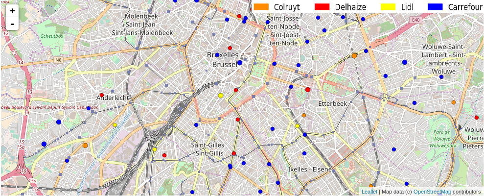
We can already see that the various brands have quite different implantation strategies in Brussels. Some of them might be due to historical reasons. We can see that there are many Carrefour shops and that those are generally located in streets in the middle of a neighborhood. Those are likely relatively small shops with a local history. On the contrary, we can see that Colruyt and Lidl are generally located close to main roads and axes. Delhaize strategy seems to be somewhere in between. Given these orthogonal strategies, it is not easy to identify which brand is dominating in a specific area.
In order to better visualize the influence of each brand in Brussels, we can use a grid to split the Brussels map into 150 x 75 small cells. For each cell, we compute what is the average time to travel from that cell to all identified shops. We can then pick-up the closest shop in travel time. We can use the Open Source Routing Machine (OSRM) service to compute the travel time (by car) between two points. There is a public server with a RESTful API that can do such computations for us. Actually, we can do the computation of several points at the same time by providing up to ~100 coordinates through the GET request. The API response takes the form of a JSON file containing, among other things, a time distance matrix to go from the source coordinates to the destination coordinates. Thanks to this (free) API, the task is therefore quite simple.
We are then just left to draw the cells onto the map with a color indicating the brand of the closest shop.
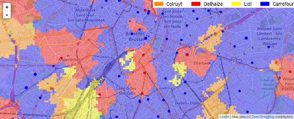
From this colored map, we can see that Carrefour is dominating the map. Nonetheless, the other brands also cover significant areas and they do so with much fewer shops. So they might actually be winning the fight of investment versus coverage.
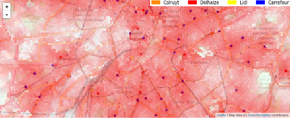
More interestingly, we can now have a look at the map showing the travel time to the closest shop. Red color indicates small travel time, White color indicates a travel time larger than 5 minutes. The color shade in-between indicates the travel time somewhere between 0 and 5 minutes. This map is very instructive because it allows realizing the importance of the main axes into the implantation strategy of some brands. It also allows spotting Brussels area where all supermarkets require a ride of more than 5 minutes. Those areas are good candidates for new shop implantations as they would almost guarantee to redirect the local population to the new shop brand.
This is the end of this benchmark demo, but they are several other things that we could do with such geospatial data analysis. Just to cite few of them: we could, for instance, correlate the information to the local census data. This would help identify the area where the local density of population is high and where there are no other shops nearby. We could also correlate these areas with real estate data in order to find good location/price commercial surface for renting. We could take into account the size of the supermarket into the neighborhood sharing map. We could correlate supermarket locations with nearby other types of shops like fuel stations, car store, DIY store, etc. We could build new maps with new shop implantation hypothesis and see how much we could steal business to the competitors. Etc… As usual, possibilities are endless.
The code used for this benchmark demo is available in a notebook format on NBviewer. Unfortunately, it doesn't handle map properly, but it gives you access to the code to reproduce my analysis. Feel free to play with it.
Have you already faced similar type of issues ?
Feel free to contact us, we'd love talking to you…Don't forget to like and share if you found this helpful!